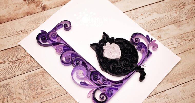
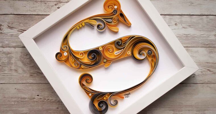
Crafting a Multithemed Quilled Letter I
In the world of quilled paper art, every creation is a unique expression of creativity and imagination. Recently, I embarked on a fascinating journey that pushed the boundaries of my craft—a commissioned a multithemed quilled letter I monogram that incorporated an eclectic mix of elements,…